5 Top UX do’s and dont’s that help you build a captivating Customer journey
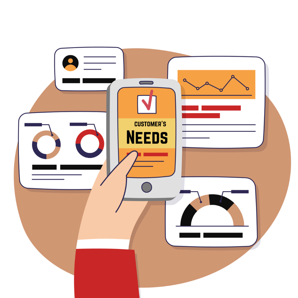
Do understand your users first
“People ignore design that ignores people.” — Frank Chimero
Before jumping into anything, think about who you’re designing for.
Who are your users? What are their goals? What’s important to them?
Talk to them and and understand their pain points and see how they are working in their actual environment. It might seem obvious, but understanding your users will help you create a better product in less time.
Perform user-centered design research. Collect data about their needs and goals. Create user personas based on the collected information and stick yourself to these personas throughout the design process.
Prioritize features
For a new user, a feature-rich interface can be intimidating—it’s more difficult to learn something when there are a lot of things to learn. A good rule of thumb is that if it doesn’t solve an immediate problem for your users, you shouldn’t include it in your design . You should ask yourself: What features does my product absolutely need? Focus on refining the experience around your core objectives.
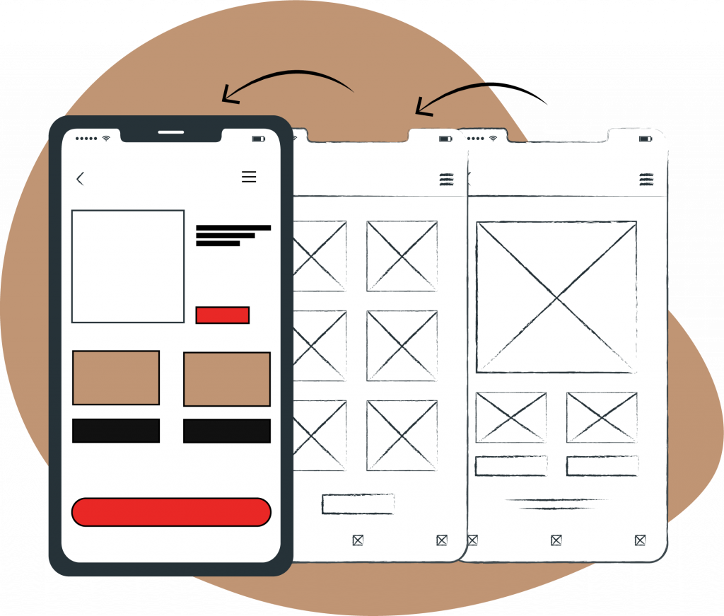
DECLUTTER THE SPACE
A famous saying by Antoine de Saint-Exupéry can be applied to mobile UX design: “Perfection is achieved when there is nothing left to take away.”
Clutter is terrible on a desktop, but it’s way worse on mobile devices where users have limited screen space. Less distractions to your users means a smoother journey through your content.
Strive for Minimalism – Focus only on what is most important and remove anything that doesn’t serve a purpose. Minimal use of decorative elements such as gradients and drop shadows will help you keep the interface light and airy.
Try to design each screen for one thing and one thing only, with no more than one call-to-action. This makes it both easier to learn and easier to use. A few clear screens are preferable to a single cluttered screen.
add clear navigation
Don’t let your users feel lost or confused. Be it the web or mobile, it is very essential that the well crafted features are quickly and easily accessible.
Use navigation patterns that are familiar to your target audience so that the navigation doesn’t require any explanation.
Information architecture is about organization of information in a clear and logical way. Organize your information in a way that requires a minimum number of actions to reach the destination.
Users should be guided to the content they’re looking for, quickly. People should always know where they are in your app so they can navigate successfully.
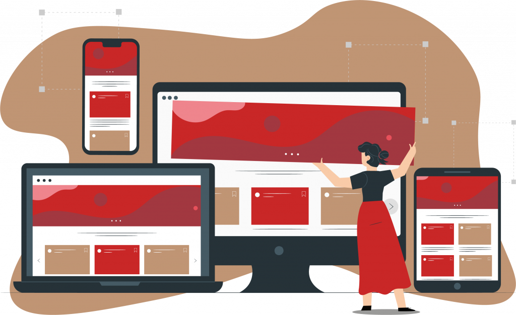
Responsive UX
The days of designing a site or application for one device or screen size are long gone. With responsive design, your interface needs to adapt to different screen sizes and resolutions so users can have a seamless experience no matter what device they use. This is accomplished by using flexible grids, CSS3 media queries, fluid images, videos and more. The good news is that great tools like Bootstrap make it really easy for you to create engaging responsive designs.
NOW THE DONT'S
DON'T STRIVE FOR PERFECTION IN FIRST ATTEMPT
Follow an iterative process and not strive for a perfect product based on your first attempt.
Powerful prototyping techniques such as rapid prototyping can help designers to iterate fast. Based on insights gathered from testing sessions it’s possible to design better experiences for the users in each new iteration.
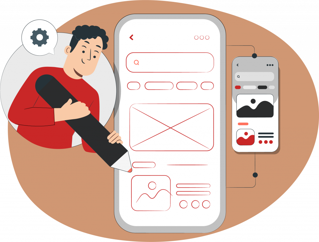
don't design in isolation
It’s easy to get caught up in what we like personally and forget that our audience may be different. Working with others can help keep us grounded in reality while also giving us fresh perspective. This is especially important when you work alone, but it’s still a good idea to schedule regular meetings with other designers or colleagues to bounce ideas off of each other and get feedback on your concepts.
DON'T ASK FOR PERMISSION RIGHT AT THE START
Quite often as we just launch a just-downloaded app, there’s a shower of app permissions (e.g. “Allow app X to use your location?”). Unless we’ve used the app and become well-aware of the app environment, how do you give the permissions?
It’s better to ask for permissions in context and communicate the value the access will provide. Users are more likely to grant permissions if asked during a relevant task. Request permissions at launch only when it’s absolutely necessary for the core app UX.
don't use too many gestures
A common practice amongst the majority of the mobile app designers: Avoid using personalized gestures as a primary way of interacting with the app. This limits the user interaction with the app. Sometimes these gestures can be the supporting mechanism for the mobile app. However, it is best to avoid too many gestures and stick to the standard ones, as standardization is the key to a good UX of the app. The mobile user needs to see standard symbols and controls for the common actions to be able to recognize them easily.
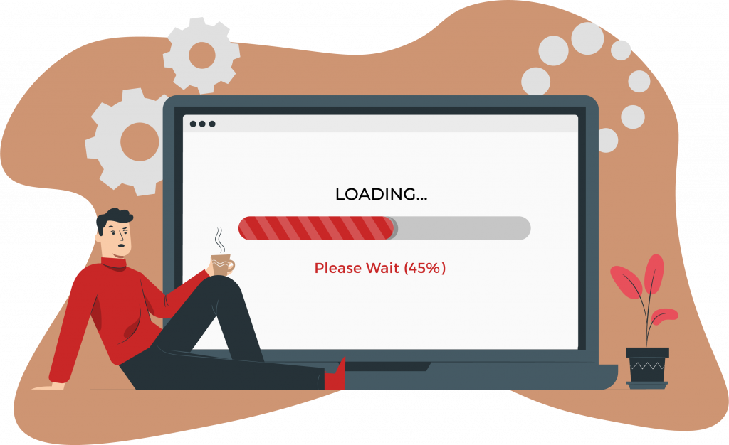
Don’t make users wait for content
A blank screen, shown when content is loading, can make it seem like your app is frozen, resulting in confusion and frustration.
Also, you should avoid creating dead-end pages in your apps because they act as blockers for user flow — they create confusion and lead to additional (and often unnecessary) actions.
You should always strive to give the impression that your app is fast and responsive.